Monday, 29 April 2013

THE WANT: STEPHEN KENN INHERITANCE COLLECTION

Stephen-Kenn-Inheritance-Collection.jpg
Want NEED this. Retail stores are one of my biggest sources of inspiration, so a few months ago when I was in a J Crew store I snapped a picture of what I thought was a really cool, simple, couch. Further aimless internet searching eventually led me to figure out exactly what this cool creation was: a couch designed by Stephen Kenn from his Inheritance Collection

J-Crew-Couch.jpg
The couch in question. This couch is so PUNK ROCK.

Basically Stephen Kenn is perfect - a really cool, young and handsome furniture designer from L.A. who probably spends most of his time making cool things and brooding. Check out his website for a cool glimpse into his philosophy behind the Inheritance Collection and to catch some dreamy scenes of him on his motorcycle. 

(*Note to self: get a motorcycle).

The couches are rugged and utilitarian, using basic welding for the frame, straps and harnesses for the support, and cushions covered in reclaimed WWII military material. 
Stephen-Kenn-Couch.jpgStephen-Kenn-Loveseat.jpg
Military-Couch.jpg
The material is surprisingly soft to touch, and the grommets up close have this awesome quality as they are a bit beaten up and worn. Also, the material is blemished and imperfect, with some patches and spots which only adds to the look. 
Stephen-Kenn-Chair-Ottoman.jpg
Military-Chair.jpg
When I originally took the picture of the J Crew couch, I thought to myself that this would be a pretty simply DIY. I still think so, and am strongly considering making this a summer project for myself. 

Naturally, these couches don't come cheap; the biggest sectional costs an even $5000. But I'm pretty confident I could throw together the loveseat for a fraction of that.

My hypothesis:

-Get a super basic frame professionally welded
-Pick up some army material from the local Army Surplus store
-Purchase some foam
-Get some harnessing strap
-Pick up some brown leather belts and SLAP 'ER ALL TOGETHER.

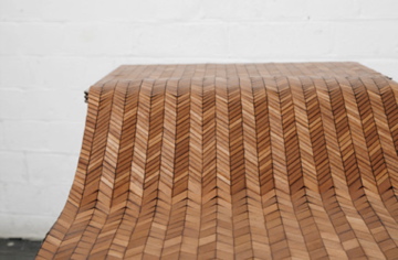
Probably, they won't turn out quite as beautiful as this:
Metal-Frame-Chair.jpg
Harness-Straps-Chair.jpg
...but in a video on the website Mr. Kenn explains that he is glad to reveal the process (although probably not so people can rip him off), and this picture also gives a few hints.  

Stephen-Kenn.jpg

What do you think? Can I do it?!


To infinity and beyond. 

bZd


Sunday, 21 April 2013

RUG HUNT

Don't ask why, but I decided to walk through Marshall's today. Basically a store full of clothes I wouldn't buy, but their "Home" section was actually pretty good! The prices were all very reasonable, and their offerings were actually desirable. (This, if you haven't noticed, is becoming increasingly rarer.)

Lots of great decorative pillows, a killer coffee table book section, and a nice selection of rugs.

Oh how I long for a new rug. I still (and hopefully always will) love my Persian rug that I bought when we first moved in, which I wrote about here

But the first picture from that post has always inspired me to move that rug into the dining area. For those of you who are too lazy to click the nicely provided link, here is the picture:

Persian-Rug-Dining-Room.jpg

Also, notice the Eames chairs? Are we learning something? 
Alright, enough shamelessly plugging my own blog.

Please take time to enjoy the above image before subjecting yourself to a hideous picture of the dining room area of our apartment:

Dining-Room-Parquet-Floors.jpg

Sigh. Our apartment, like most in Toronto, is cursed with yellow parquet floors. So, if you can, why not cover them up with luxurious Persian rugs? Luxurious Persian rugs for everybody! We aren't total savages and we do actually own a dining set. As well this area has been pimped out with a recent new light acquisition and accompanying faux ceiling medallion (dammit I said I wouldn't do it again!) but I just know that the Persian rug would look and fit splendidly right on top of that nasty Jenga-piece floor!

Here is a picture of where the rug is currently residing. I love the rug here, but would prefer to see it migrate. 


Living-Room-Persian-Rug.jpg

The question is, what to replace it with? I don't think I would like to go the route of getting another Persian. Too many Persians in a room and... oh never mind. But back to Marshall's!

I was flipping through the rugs when a few of them caught my eye. I have been fawning over Morgan at The Brick House's Beni Ourian rug. For those of you out-of-the-know, here are some pictures of some Beni Ourain rugs in all their white fluffy, geometric glory:

Beni-Ourain-Rug.jpg

Beni-Ourain-Rug.jpg
(via Pinterest)

West-Elm-Rug.jpg
(via West Elm)

Hummina hummina. So when I was fanning through some rugs at ol' Marhsall's I was excited when I saw these:

White-Diamond-Patterned-Rug.jpg

Diamond-Patterned-Rug.jpg


Geometric-Rug.jpg

Not Beni Ourain, but certainly an allusion thereto. Let me be clear in stating that $200 is not what I would like to spend, but then again looking at the prices of some authentic versions (we're talking thou$and$) $200 might not be so bad. They are both REALLY soft and a big size for the price. 

I've also been considering a cowhide rug. Ikea sells them, but they're even more expensive than these Marshall's ones. 
Cowhide-Rug.jpg
(Ikea KOLBY rug)

My only concern is that going to a more neutral rug will take all the colour out of the living room. The paintings, the couches, the table, are all brown or black (for now), so I'm not sure if a rug like any of these examples would make things just a little too down with the brown. 

What do you guys think? Which Marshall's rug did you like better? Or should I just screw it and keep looking?


bZd


Wednesday, 10 April 2013

GUESS WHO LIVES HERE!

Ellen-Degeneres-House.jpgEllen-Portia-House.jpg

Ellen-Degeneres-Portia-deRossi.jpg

Ellen-Degeneres-Elle-Decor.jpg


Ellen-DeGeneres-Jay-Holman.jpg

Ellen-Portia-Elle-Decor.jpg


Ellen-Degeneres-Cliff-Fong.jpg
(All images via Elle Decor)


Guess whose place this is. Just guess!

...Ellen DeGeneres and Portia de Rossi's. WTF?!

Like, what CAN'T this woman do. According to the article in Elle Decor, Ellen has quite a talent for interior decorating. And she's hilarious. And in the most beautiful lesbian relationship. And seems so genuinely benevolent. Ugh.

I have to admit, I am really surprised that Ellen's aesthetic is so edgy and ...good? The black and white, and caramel leather is just SO. RIGHT. ON. Granted, she did work with decorators Jay Holman and Cliff Fong. Who are they and why aren't they ME?

To be critical, I think it is a bit on the stark/cold side, but then again maybe you can afford to be in California. Also, a live horse near a parlour area? Whatever, Ellen. 

Ellen does what Ellen wants.

bZd


Monday, 8 April 2013

NEW THRIFTED ARMCHAIR

Tufted-Leather-Armchair.jpg

Not much has been happening around the apartment lately, but I did recently score this amazing tufted leather chair! How much you ask? A mere $100. 

Kijiji became my bitch once again.


Thrifted-Armchair.jpg
(Sorry about the uninspired, unstyled photos - 
these pictures are the only ones I could take 
without revealing the disaster that currently is 
our apartment.)  

I mean COME ON. Look at this thing. It even came with a matching ottoman! Unfortunately, it just doesn't fit in the space without being awkward.

As always, it came with an eventful interaction with an unassuming seller, but this time was actually quite pleasant. The guy I bought it from offered to drive the chair over to my place, during which I learned that he owns a restaurant down the street from my work (which we all love - unreal lamb burger). We also chatted about Japanese culture.

Totally normal.

This chair goes great with my existing $30 distressed brown leather couch. 


Kijiji-Armchair.jpg
Look how great the new chair sports the velvet 
American flag pillow! Someone's not having any 
problems fitting in around here!


Our living room is chillax central.

bZd


Wednesday, 27 March 2013

FAUX CEILING MEDALLION

Painted-Ceiling-Medallion.jpg

Allow me to introduce you to the faux-painted ceiling medallion. 

Faux-painted ceiling medallion, meet non-existent readers.

Some background
The apartment came chockfull of the most basic, cheap light fixtures available (popularly referred to as "boob lights"). 

Exhibit A: 


They had to go.

A huge part of making your living space personal is switching out any of the cookie-cutter basic fittings that you can. Switching a light is one of the easiest fixes and makes such a huge difference!

Unfortunately for us, taking down the existing light fixture left behind the most awful discoloured, yellowish stain - never rarely a good thing. This thing was like smokers' teeth yellow. 

Exhibit B:

Ceiling-Light-Stain.jpg

This too had to go.

A ceiling medallion may have been the obvious choice (repainting the ceiling was just not happening), but I didn't like the design of any of the ceiling medallions anywhere I looked - they are either way too ornate or just too chunky looking. I wanted to keep it minimal, so I thought WHY NOT JUST PAINT OUT THE CIRCLE BLACK, TO MIMIC A CEILING MEDALLION? The vintage metal pendant fixture I bought from Kijiji a few weeks ago was destined to go where this unfortunate stain was, and I knew that the fixture, cord and cap were all going to be painted black, so the leap seemed logical.

The process was actually harder than I expected. First of all, craning your neck and contorting your body to paint on the ceiling blows. Also, I thought I could just sort of "free hand" the existing outline of the yellow circle stain and move on. 

Here is what it looked like when I stepped down from the painting to have a look:

Paint-a-Ceiling-Medallion.jpg

Yikes. 

So I had to go back with a smaller brush and continually round that baby out. It took some doing, but I pretty much got there. 

The faux-painted ceiling medallion does a good job balancing the weight of the actual pendant with some substance on the ceiling. If you can imagine the fixture only hanging from the smaller cap, it just seems inadequate up there.

Faux-Ceiling-Medallion.jpg

I think this is a resourceful way to cover up similar stains if you run into the same problem somewhere you are renting. The BEST part is that you can just throw the ugly old boob light back up when you leave and no one will ever know the difference! 

Stain or no stain, I think it is a cool effect. I imagine the same application in bright, vibrant colours would look really awesome too, bringing an unexpected pop of colour to your often-overlooked ceilings. 

By the way - that lamp amirite? I rewired it with some basic lamp cord from Home depot, bought a cap and sprayed all of it with a high-heat black enamel spray paint. This was recommended online, to avoid wear and discoloration from the heat of the light bulb. It's not anymore expensive than normal spray paint, and doesn't give off any weird smell when the light has been on for a while. 

Word.

Painted-Ceiling-Medallion.jpg

An artsy b&w pic of the new lighting situation. 

I dig it. What do you all think?


bZd


Sunday, 24 March 2013

GALLERY WALL


Gallery-Wall.jpg

Ch-ch-ch-check it out!

So I made this on the weekend (read: finally got around to hanging it on the wall). 

It was cheap and fast, just how I like it. 

Total cost you ask? About $35.

After Christmas, IKEA was having a 50% sale on their RIBBA Frames, so I went a bit nuts. This isn't even half of the frames I bought. But these already incredibly cheap frames were double the cheapness! So the total cost of these frames was around $30. Total steal. 

For the art, I bought a pad of manilla craft paper for $2.99, a cheap paintbrush and a tube of black acrylic paint and WERKED. IT. OUT.

Two pictures I had posted on my Pinterest account had been stuck in my head for a while, and I desperately wanted to get some sort of gallery thing happening over the couch.

Vintage-Gallery-Wall.jpg

The first picture was an amazing collection of what I assume are old shooting range targets, grouped in a tight arrangement with all black frames. I love the circular repetition, and it incorporated just the right amount of black. The varying shades of the paper also really turned me on? 

Crow-Silhouettes.jpg

The next was of this pair of Edgar Allan Poe-esque raven silhouettes, that were beautiful in their simplicity.

I knew both could be easily DIY-ed, and because I liked both of them so much, I just smashed the two together into a clusterf&*k of paintings, threw them over my couch and called it a day.

For those of you looking for a How-To, I really just Googled some crow silhouette images, drew them freehand and filled them in with black acrylic paint. With the circle art, I found that (for whatever reason) I still owned a geometry compass and used that to make some circles.

Paint-A-Crow.jpg
Look at me go! Just crankin' out MAGIC. 
Seriously, people do this for a living?*


(* I actually respect artists.)

With regards to the hanging, avoid the common mistake of hanging your art too high. ALWAYS hanging your art at eye-level. The pros suggest 57" for the vertical centre of whatever you're hanging - but you can generally eyeball it. For a gallery arrangement like this one, the spacing between each of the pictures is important. This I did measure carefully, and went with 4.5" between each. 

Here is a glare-y picture to give some context of how the arrangement fits on the wall. Hanging everything too high creates an awkward negative space between the top of the couch and the gallery. 

Stick to the rules and you should make it out of this OK.

Black-Frame-Gallery-Wall.jpg

What I did really like about the arrangement of targets though, was the idea of a black matte (instead of the traditional white) that highlighted some of the frames. 

I had more mattes than I knew what to do with, so I decided to risk one and spray paint it black. And guess what? It worked perfectly! I was afraid that it would seem uneven, or have weird paint speckles but it didn't. I even took this weird close-up picture for any haters out there! (Not a great picture, just take my word that it is perfectly smooth).

As always, the basics of spray painting still apply: APPLY MULTIPLE THIN COATS. Do not expect to cover it heavily in one go. But you know that by now, don't you?

Spray-Paint-Matte.jpg

Spray-Paint-Mat.jpg

Here is a ghetto over-exposed pic of me mid-way through spray painting the matte. Not sure why I took it.

Black-Frames-Gallery-Wall.jpg

I'm really happy with how it all turned out. No need to spend time looking around for art which is always way too expensive anyway. Stick it to the man and make your own!

Happy crafting.

bZd


Wednesday, 13 March 2013

THE WANT: HERRINGBONE FLOORS

(via inquemode)

Oh how bad would I love the ugly parquet of our apartment be replaced by herringbone or chevron floors.

Let me count the ways...


Herringbone-Floor.jpg
1.

French-wood-floor.jpg
2.

Chevron-Pattern-Flooring.jpg
3.

Chevron-Wood-Floor.jpg
 4.

Herringbone-Wood-Floor.jpg
 5.

Chevron-Wood-Flooring.jpg
6.

These floors always remind me of a beautiful house I lived in in France for a short while. These patterns add so much more interest, rock and balls to your floors than your traditional straight and narrow flooring pattern. 

I think this look is best achieved when it has that rougher, rawer more rustic feel and so I think using less expensive, lower quality flooring would actually work in your favour. And I believe shorter floorboards are actually less expensive too, non?

Win win. 

                          Chevron             Herringbone


Also, though this post is titled "Herringbone Floors", some of the above pictures also feature "chevron" patterned floors. Above is a diagram for you to figure out which are which.

Good luck.

bZd