Showing posts with label #dreampad. Show all posts

Tuesday, 19 April 2016

HOW TO CREATE AN INEXPENSIVE GALLERY WALL!

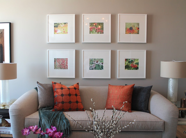
Our last project was a great exercise in the high/low mix. And, of course*, it turned out amazing. (*Read: our projects always turn out amazing.) One of the best money-saving techniques we used in the space was actually one of the strongest focal points - the gallery wall above the sofa.

gallery wall

Can you believe it, this gallery wall only cost a total of $250?! This is a fraction of the price you could pay for even one measly piece of art and in our opinion the look is so much more dynamic. Splurging on high-end art isn't totally necessary most of the time, and a gallery wall offers you greater flexibility to change out the images down the road if you feel the need for a changeup.

ikea ribba frame

One of the big reasons we saved on this arrangement was because we went with simple IKEA Ribba frames. Each one only costs $20! If you've ever looked into pricing for custom framing then be prepared for a shock - it's super expensive and again not always worth it.

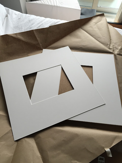
IKEA frames can be pretty easily recognizable and what we didn't like about the way they came "off the shelf" was the square mat opening. So, as a way to both disguise the fact that these were IKEA frames and to make them slightly more "custom" looking, we had custom mats cut at a local framing store. 

custom framing mats

The frames were cut to have a more rectangular opening, took no time at all for the store to do and each one was also only $20.

To fill the frames, our client had a beautiful set of photos she had taken herself with her own camera. She used a computer program to give them a beautiful watercolour effect, so we chose 6 that balanced well in terms of colour, subject, etc. and got them printed on card paper at our local Staples store for only $8!!! 

diy gallery wall

Next, we taped the photos into the frames along with our new custom cut mats. Be careful here that your photo lies perfectly when you tape it - any bubbles or gaps will be way more noticeable once the frame is hung. 

ikea gallery wall

gallery wall frames

In fact, it is best to put tape not only at the corners but also around the edges of the image to be extra sure that no bubbles or gaps will be seen. 

Before hanging the frames on the wall, we played around with the best arrangement for the 6 photos to be hung together. Again, a balance of colour, texture, etc. is key here. For example, there are three photos that contain a lot of red/pink/fuschia tones. They are the photos at the bottom left, centre top, and bottom right. They were dispersed evenly throughout the group so that there wasn't too much of the same colour in one area which would throw off the balance. 

Sometimes our own level of good taste and expertise surprises even us!


white frame gallery wall

Finally, find a guy with a hammer, tell him where to put your frames, have him whack some nails in the wall and hope that he followed your instructions properly. In our case, thankfully he did.

As I said earlier, art doesn't need to be expensive. Had we not gone with custom mats for these frames, this arrangement would have been even less expensive. Heck, throw your own scribbles into the frames and you can even save the $8 on photo printing. Live your own life. 
bz interiors toronto
To review, here is the cost breakdown of everything:

6 IKEA Ribba Frames - $120
6 Custom Cut Framing Mats - $120
Photo Printing - $8
Custom Gallery Wall Tailored to Your Exact Tastes - Priceless.

bZi

Tuesday, 7 January 2014

THE WANT: SERGE MOUILLE LAMPS

Serge-Mouille-sconce.jpg

Serge-Mouille-light.jpg


Serge-mouille-floor-lamp.jpg

Do you like these lamps? No?

Well too bad because they're trending. 

They're sometimes called 'Praying Mantis Lamps'. Does that make them any more appealing?

These light fixtures are designed by French sculptor Serge Mouille, and have been showing up EVERYWHERE. (Including the cover of January's House&Home, featured in a design by Mazen el-Abdallah.)

I must admit, I'm a fan. I think they're sleek, graphic, interesting, and really pop in an eclectic scheme with white walls (my favourite). 

Naturally, they're expensive. Like $9000 expensive. Knockoffs Imitations are available at around the $900 mark if that seems any more reasonable. 

Are they worth it? Look for yourself!

Serge-Mouille-decor.jpg

Serge-Mouille-living-room.jpg


Praying-Mantis-lamp.jpg

Serge-Mouille-Bedroom.jpg

Serge-Mouille-Kitchen.jpg
Serge-Mouille-photograph.jpg

There he is above, the man himself. What a looker. Was he seriously engaged in whatever he's holding here, or just posing intellectually?

You be the judge. 

bZd


Monday, 4 November 2013

FLOOR TO CEILING SUBWAY TILE

Listen here, BUD.

I'm not gonna pretend to tell you that subway tiles are anything new or exciting. One thing I have been noticing a lot lately, however, is the twist of taking them from floor to ceiling up an entire wall. 

A good ol' Google search of "Victorian Industrial" a while back (another popular trend - think Edison lightbulbs, raw wood and black metal) brought me upon this inspiring image:

Victorian-Tile-Kitchen.jpg
Very 'Downton Abbey'. 

And while dining out at Bent Restaurant in Toronto, I noticed something similar here as well:

Bent-Restaurant-Toronto.jpg

This picture isn't a great example, but they too ran white subway tile from floor to ceiling. 

Further Googling led me to the following inspiring imagery to share with all of you, to prove how cool a treatment I think this is.

Floor-To-Ceiling-Subway-Tile.jpg
via 
(HGTV designer Tommy Smythe's kitchen)

White-Subway-Tile-Kitchen.jpg
 via

Subway-Tile-Wall.jpg

Subway-Tile-Bathroom.jpg

Black-Subway-Tile.jpg
via 
(This time in black!)


Subway-Tile-Bathroom.jpg
(Love the textured tile here)

Subway-Tile-With-Stripes.jpg
(Really dig the sort of varsity-style stripes)

Full-Wall-Subway-Tile.jpg

Entire-Wall-Subway-Tile.jpg

White-Subway-Tile-Black-Grout.jpg


If you have the time or care enough to go back and review the above images, you may/may not notice that some examples have been finished with dark grout for higher contrast and an edgier vibe. 

Grout can be tinted a number of colours, and going dark in the first place can add life and longevity to your tiled look as it will conceal dirt and grime much better.

What do you think? Too much of a good thing? For some reason, I think it brings an old world feel, but seems altogether new and current. 

So, are you a tile-o-phile? 

bZd


Thursday, 3 October 2013

OH OH OH WHAT A FEELING...

... Wood on the ceiling!

This has been a cool idea that has been plaguing my mind lately (and unfortunately has resulted in a certain Lionel Richie song being stuck in my head). 


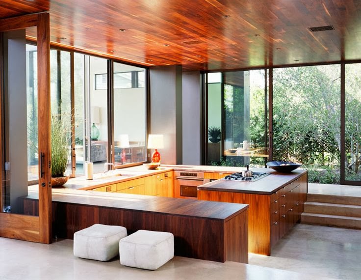
I have always envisioned that if one day I bought a condo (although I probably wouldn't) I would try to accomplish an effect on the ceiling replicating the exposed beams and woodwork of much pricier "hard lofts". The aged, rustic, warm colour from the wood would be a huge addition of character to what are normally lifeless, cold, uninspired spaces. I also began to think about a much more polished, streamlined approach that would be similar to what we are generally used to putting on our floors - except on the ceiling!


This is something that is often seen on porches and verandas, but looks OUTTA THIS WORLD when introduced in an interior space.

I have also been trying to convince my parents that this effect would look really cool at our cottage, which we are currently in the process of giving a facelift! (Stay tuned.)


Anyway, for your viewing pleasure:


Wood-On-Ceiling.jpg


Wood-Ceiling-Indoors.jpg

I love the high-lacquer, rich colour of the above three examples.

The next three photos show a more matte, light colour application.

Beadboard-Wood-Ceiling.jpg


Wood-Paneled-Ceiling.jpg

Wood-Flooring-On-Ceiling.jpg

I like the wrap-around effect featured in the next two photos, where a defined strip has been sectioned off and applied to the wall, ceiling and even the floor!


Wood-Ceilings.jpg


Wood-Ceiling.jpg

I think this idea would only work in spaces with more generous ceiling heights, as a ceiling too low could leave you feel imposed upon from above. But, I think this brings a really unexpected, cool approach to the fourth dimension of your space that, generally speaking, doesn't get much attention.


What do you think?
bZd


Tuesday, 2 July 2013

CREATIVE FLATS

Creative-Flats.jpg

Creative-Flats-Montreal.jpg

Nathalie-Bouchard-Annie-Horth.jpg

Creative-Flats-Loft.jpg

Creative-Flats-Quartier.jpg
(all images via

Just a bit of eye candy.

Creative Flats, lofts designed to absolute perfection for rent in Montreal. This is one of them. Check out the other ones. 

Très chic. 

By total babes Nathalie Bouchard and Annie Horth.

Peace.


bZd


Monday, 29 April 2013

THE WANT: STEPHEN KENN INHERITANCE COLLECTION

Stephen-Kenn-Inheritance-Collection.jpg
Want NEED this. Retail stores are one of my biggest sources of inspiration, so a few months ago when I was in a J Crew store I snapped a picture of what I thought was a really cool, simple, couch. Further aimless internet searching eventually led me to figure out exactly what this cool creation was: a couch designed by Stephen Kenn from his Inheritance Collection

J-Crew-Couch.jpg
The couch in question. This couch is so PUNK ROCK.

Basically Stephen Kenn is perfect - a really cool, young and handsome furniture designer from L.A. who probably spends most of his time making cool things and brooding. Check out his website for a cool glimpse into his philosophy behind the Inheritance Collection and to catch some dreamy scenes of him on his motorcycle. 

(*Note to self: get a motorcycle).

The couches are rugged and utilitarian, using basic welding for the frame, straps and harnesses for the support, and cushions covered in reclaimed WWII military material. 
Stephen-Kenn-Couch.jpgStephen-Kenn-Loveseat.jpg
Military-Couch.jpg
The material is surprisingly soft to touch, and the grommets up close have this awesome quality as they are a bit beaten up and worn. Also, the material is blemished and imperfect, with some patches and spots which only adds to the look. 
Stephen-Kenn-Chair-Ottoman.jpg
Military-Chair.jpg
When I originally took the picture of the J Crew couch, I thought to myself that this would be a pretty simply DIY. I still think so, and am strongly considering making this a summer project for myself. 

Naturally, these couches don't come cheap; the biggest sectional costs an even $5000. But I'm pretty confident I could throw together the loveseat for a fraction of that.

My hypothesis:

-Get a super basic frame professionally welded
-Pick up some army material from the local Army Surplus store
-Purchase some foam
-Get some harnessing strap
-Pick up some brown leather belts and SLAP 'ER ALL TOGETHER.

Probably, they won't turn out quite as beautiful as this:
Metal-Frame-Chair.jpg
Harness-Straps-Chair.jpg
...but in a video on the website Mr. Kenn explains that he is glad to reveal the process (although probably not so people can rip him off), and this picture also gives a few hints.  

Stephen-Kenn.jpg

What do you think? Can I do it?!


To infinity and beyond. 

bZd