Wednesday, 23 July 2014

COLOUR WATCH: PALE PINK


pale-pink-wall.jpg

In this post, I am going to try to convince you that pale pink is cool.

...Here goes:

First and foremost - the pink has to be PALE - drab, washed out, bland even. Not that this is the overall mood we want, but just don't think "baby", "hot", "coral" or any of those distant pink relatives. 


pale-pink-paint.jpg
 via

Second, forget the idea that pink has to be feminine; think of it more so in a retro, vintage context. The pale colours of 80's pastels, or rose-coloured glasses of the 70's.

pale-pink-tile.jpg

If it's too hard for you to forget that PINK = GIRL, then pairing it with traditionally masculine colours and furniture should do the trick.

masculine-pale-pink.jpg

 pale-pink-living-room.jpg


dusty-pink-room.jpg

Still unsure? If I really haven't convinced you then maybe (just maybe?) you could consider incorporating pale pink fabrics and accessories rather than a full-on paint treatment.

pale-pink-curtains.jpg

And if by now my poorly formed pictorial essay hasn't yet convinced you, then I'm not sure anything will. 

Point is, a pale, dusty, sombre shade of pink can actually act as a really great neutral that can bring a bit of unexpected edginess and even a bit of toughness if styled the right way. 

pale-pink-bedroom.jpg

Question is... are you brave enough?

bZd

Tuesday, 27 May 2014

THE WANT: TURKISH TOWELS

Turkish_towel.jpg

I had the pleasure of visiting Brooklyn a couple weeks ago. Had I been more organized and able to pick my jaw up off the floor (the people! the style! the vibe!) I would have documented it a little better - I was just so in the moment.

One of the highlights was visiting the Brooklyn Flea, a weekly market by the waterfront in Williamsburg. OH MAN - if I had limitless cash and a way to take more stuff home with me I would have. This place had some FINDS. 

I could only come home with a couple small things, and one of them happened to be a Turkish (or "Hammam" or "Peshtemal") towel. 

This really cool couple was selling them, in all colours and textures. They told me they were really absorbent - I was skeptical. They told me I could take it to the beach - I guffawed. But they had this cool minimalist look to them and were incredibly soft so I went for it and bought one. 

It is absorbent.

I took it to the beach. 

Damn it all.

Turkish_towels.jpg

hammam_towel.jpg

Some of them are thinner and almost like a table cloth, others are slightly more plush and almost quilted. Point is, they look awesome. I love the sort of nautical stripe and how striking they look in their simplicity. 

peshtemal_towel.jpg

hammam_towel.jpg

striped_turkish_towel.jpg

I'm really into this pale pink and navy - for some reason it seems really edgy. 

The vendors said they can be used not only as towels, but also blankets, throws, and even scarves in the winter. I've even layered mine with my bedspread and it looked awesome. Pretty good bang for the buck I'd say. 

Not only do they look cool, they also bring a bit of luxury, a touch of the exotic, and the right amount of worldliness - as though they were picked up while away in some far off destination. All of this without being too flashy. 

So, are you ready to step up your shower game?
bZd


Wednesday, 7 May 2014

CONCRETE WALLS

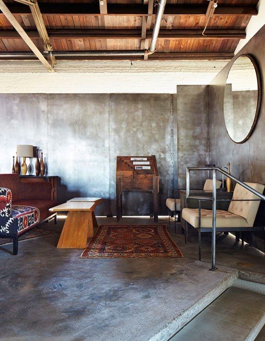
Maybe this whole industrial thing is getting a bit out of hand, but I have to say that I am pretty into the prevalence of concrete lurking from all corners lately.

Concrete tables, DIY concrete planters, inefficient lightbulbs, you name it!

Mostly, I have spent my days dreaming about concrete walls:


...Catchin' my drift?

I've been working on a large scale project for the last couple of months, and the client wanted an industrial look in what is currently a very dated, plain space which is void of any character.

I wanted to combine the classic elements of exposed brick, industrial lighting, etc. but also couldn't escape the idea of concrete walls

There are now wallpapers that exist which are shockingly realistic (albeit quite expensive) but can easily achieve this look. Due to the size of the space I'm working with, I was worried that even the slightest glimpse of a wallpaper seam would spoil the whole effect. 

What I have wondered about - and I am almost positive this is what I have seen in some retail/hospitality spaces - is if it is possible to apply a thin coat of very fine, high quality concrete (the kind used for countertops) spread evenly over drywall or any surface to create the appearance of a wall made entirely of concrete.

That is what this woman has written a little tutorial about, and it seemed to work out pretty well! (Although, not really the same kind of look I'm going for.)

I think we are going to be brave and attempt this in my current project, and if I don't re revert back to my complete blog neglect then I will try to report how it goes. 

I leave you with a textural image of concrete to get your creative juices flowing:


How can you incorporate concrete into your space?

bZd

Wednesday, 19 March 2014

DIY INDUSTRIAL CHANDELIER

Woops.

I've been away. Minor hiatus. No one noticed. 

But I'm back! And do I have things to TELL. 

Let's start off on a sad note, with a picture of our dining area: 


The dining area was fine. It featured a wayback-playback project from when I painted a thrifted barn style lamp. It also featured a large painting I had done to replicate a slab of black veiny marble that I had planned to write a tutorial about but never got around to OK?!

Either way, I was feeling the winds of change.

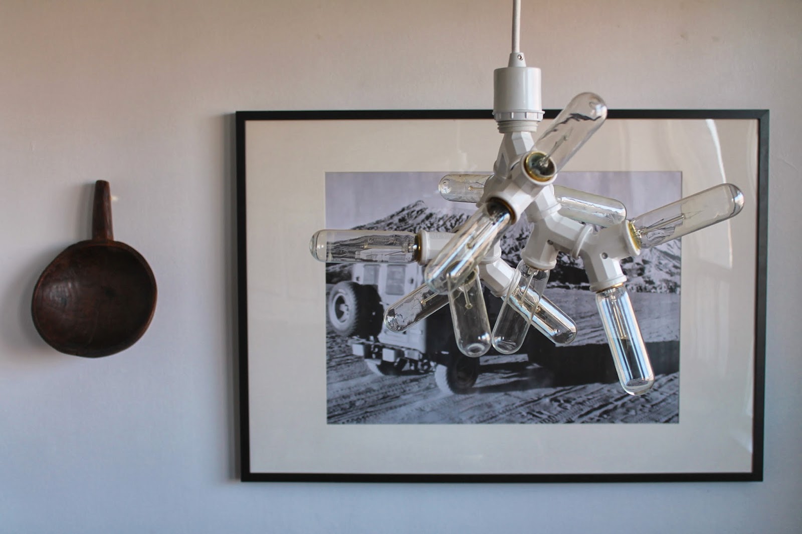
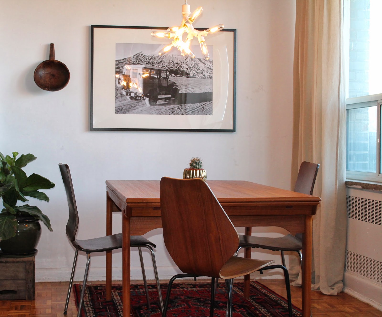
So I created this: 


Pretty neat, amirite? Super easy and pretty ingenious. For just over $100, this lamp can too be yours by purchasing a few socket splitters (Home Depot), some lightbulbs (anywhere) and a lamp hanging kit (West Elm). Screw everything together, hang it and you're done!

Having so many lightbulbs threw off some pretty intense light, and I didn't want to pay $12 per bulb for some vintage Edison style bulbs. So, for about $10 I installed a dimmer LIKE A BOSS (read: after watching a 2 minute YouTube tutorial).


Obviously, I also changed up the styling a little bit. It was there before but has yet to be mentioned - I bought a fycus! (Or fig leaf tree). These are the current BUSINESS when it comes to houseplants; a stylists bread and butter lately seen all over every design magazine and website everywhere, ever.

Also, I once again utilized my thrifty black and white photo technique to change up the art game a little bit. I took this photo while on vacation a few years ago and have always loved the composition, so, I threw it in a frame I already had and blew 'er up... for $1.97 at Staples. 

I design on the cheap and you can too! 


I also threw in a wooden, tribal-looking spoon and a mini cactus for good measure. As one does. 

He is new to the group and a little bit shy, but I think this Sputnik-inspired, alien-looking, industrial-, minimalist-, freaky little fixture is going to fit in just fine!

bZd


Monday, 10 February 2014

CONDO PROJECT

I've been busy over the last while finalizing a project that I haven't mentioned. 

I have finally completed a condo living room! 


...Not too shabby if I do say so myself. 

I can't even tell you how nice it was to put the finishing touches on something - anything - and moving on feeling satisfied. 


And check out that styling! 

The client, Jill, is a single professional downtowner who already had a great sense of style, and we worked together brilliantly! She had pretty masculine tastes - square edges, clean lines, symmetry - but also craved a feminine vibe. 

We decided to channel a sort of tribal, safari-like feel with yellow accents. 


And there she is! The beautiful homeowner herself. The most satisfying part of the project has been how happy Jill is with the result - I know she'll always look forward to coming home and who can blame her!

By the way, some other "secret" projects from the pipeline are also going to be unveiled soon...

bZd


Wednesday, 29 January 2014

COLOUR WATCH: DARK GREY

Something I have been really drawn to for the last little while looking at pictures of good design is the use of dark grey. I find this colour acts as an amazing backdrop for the medium-toned woods like walnut and teak that are so popular right now. It also looks really good when accented with big hits of white and, of course, black. 

While I am still considering how to change up my bedroom (with nothing accomplished and ever-increasing procrastination) I can't seem to shake the idea of painting my room this colour - if only just one wall. 

Check it out!
dark-grey-paint.jpg

blue-grey-room.jpg

dark-grey-walls.jpg
(uploaded by me a long time ago, unknown source)

grey-dining-room.jpg

blue-grey-paint.jpg

dark-grey-living-room.jpg

The colour seems surprisingly warm and inviting, given that grey usually connotes a cold and dreary mood. 

What do you think? Would you be brave enough to try it?
bZd


Wednesday, 8 January 2014

MORE STYLING


Look out world! I styled this.

I also happen to live here. Life is good.

I have been seriously considering getting into styling lately, so have been doing a bit of experimenting around my place. What do you think? I'm channelling a bit of Nate Berkus here. It feels right.

The 'Southbound' picture  was a little project I undertook that only cost around $20! I took the photo myself at Dupont station in Toronto with an SLR camera. The mosaic texture and the word itself I thought were really cool, so I adjusted the contrast on iPhoto and took it to Staples to get it blown up. The blow up only cost around $5 and I got the frame on sale from IKEA for about $15. Not bad!

Everything is coming together very nicely in the living room if I do say so myself. 

Is anyone in need of some stylin'?


bZd

Tuesday, 7 January 2014

THE WANT: SERGE MOUILLE LAMPS

Serge-Mouille-sconce.jpg

Serge-Mouille-light.jpg


Serge-mouille-floor-lamp.jpg

Do you like these lamps? No?

Well too bad because they're trending. 

They're sometimes called 'Praying Mantis Lamps'. Does that make them any more appealing?

These light fixtures are designed by French sculptor Serge Mouille, and have been showing up EVERYWHERE. (Including the cover of January's House&Home, featured in a design by Mazen el-Abdallah.)

I must admit, I'm a fan. I think they're sleek, graphic, interesting, and really pop in an eclectic scheme with white walls (my favourite). 

Naturally, they're expensive. Like $9000 expensive. Knockoffs Imitations are available at around the $900 mark if that seems any more reasonable. 

Are they worth it? Look for yourself!

Serge-Mouille-decor.jpg

Serge-Mouille-living-room.jpg


Praying-Mantis-lamp.jpg

Serge-Mouille-Bedroom.jpg

Serge-Mouille-Kitchen.jpg
Serge-Mouille-photograph.jpg

There he is above, the man himself. What a looker. Was he seriously engaged in whatever he's holding here, or just posing intellectually?

You be the judge. 

bZd