Friday 13 January 2017

MODERN RUSTIC

At BZ Interiors we're not the biggest followers or subscribers to design trends but we do believe in taking inspiration wherever the lightning bolt strikes!

We are perpetually influenced by the flux of traditional and modern and aim to achieve this with all of our designs. Antique with cutting edge. Patina with polish. New with old. The result is something that is T-I-M-E-L-E-S-S.

One thing we have been witnessing and enjoying a lot lately is something we've dubbed "Modern Rustic". Here are some photos to get you on our page:


The term 'Modern Rustic' is a perfect example of these contrasts working together. It's traditional but with unexpected finishes and modern shapes. An obvious commonality with all of these photos is the use of rustic beams and rustic wood but it isn't the only determining factor! 

We're (hopefully) moving away from the barn board trend which has been prevalent (and overused) for the last few years. It's also slightly different than the 'Modern Farmhouse' trend which is also a big thing today, but before we confuse you any further just stick with us and we'll steer you in the right direction so that your space stays current but not "trendy"... which is exactly what this style is about. 

bZi

Monday 12 September 2016

ALL THE MARBLE

We've lost our marbles... over marble. Can't stop obsessing about laying it on thick everywhere. Countertops, walls, floors, backsplashes, even full drawers are fair game. 

Check these out:

(Bathroom at Le Marais Hotel in Paris)


(Bathroom of design dream[boat] team Nate Berkus and Jeremiah Brent)


(Design: Rar Studio, Photo: Fernando Guerra)


The dramatic marble shown in most of these photos is 'arabescato' marble - crazy amount of movement but in muted black and white. What's also common to all of these photos is that the marble is balanced with warmer finishes (brass, wood) to keep things feeling warm and cozy. 

I've heard that exposing marble to high amounts of water can cause it to discolour/yellow over time so it may me best to use it strategically where it can be the main focus but not be getting soaked. Nate and Jeremiah did a nice job of that (third photo from the top) in that they used it on the entire wall behind their sinks. Well played boys...

How much marble can you handle in YOUR bathroom?
bZi

Tuesday 19 April 2016

HOW TO CREATE AN INEXPENSIVE GALLERY WALL!

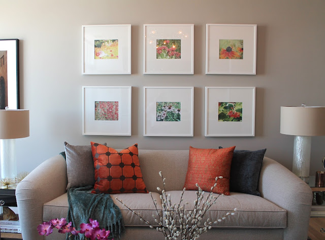
Our last project was a great exercise in the high/low mix. And, of course*, it turned out amazing. (*Read: our projects always turn out amazing.) One of the best money-saving techniques we used in the space was actually one of the strongest focal points - the gallery wall above the sofa.

gallery wall

Can you believe it, this gallery wall only cost a total of $250?! This is a fraction of the price you could pay for even one measly piece of art and in our opinion the look is so much more dynamic. Splurging on high-end art isn't totally necessary most of the time, and a gallery wall offers you greater flexibility to change out the images down the road if you feel the need for a changeup.

ikea ribba frame

One of the big reasons we saved on this arrangement was because we went with simple IKEA Ribba frames. Each one only costs $20! If you've ever looked into pricing for custom framing then be prepared for a shock - it's super expensive and again not always worth it.

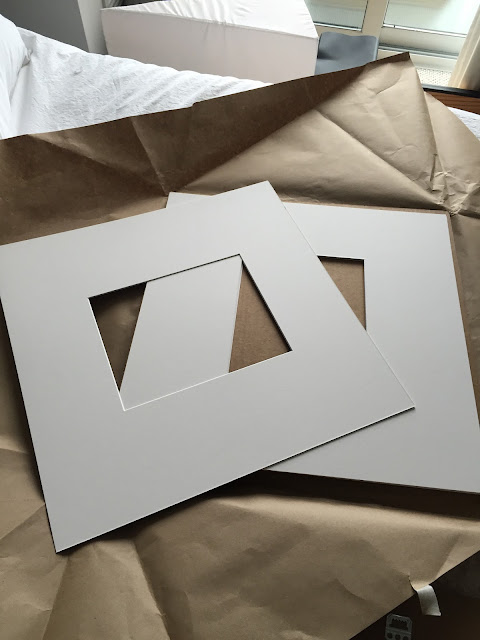
IKEA frames can be pretty easily recognizable and what we didn't like about the way they came "off the shelf" was the square mat opening. So, as a way to both disguise the fact that these were IKEA frames and to make them slightly more "custom" looking, we had custom mats cut at a local framing store. 

custom framing mats

The frames were cut to have a more rectangular opening, took no time at all for the store to do and each one was also only $20.

To fill the frames, our client had a beautiful set of photos she had taken herself with her own camera. She used a computer program to give them a beautiful watercolour effect, so we chose 6 that balanced well in terms of colour, subject, etc. and got them printed on card paper at our local Staples store for only $8!!! 

diy gallery wall

Next, we taped the photos into the frames along with our new custom cut mats. Be careful here that your photo lies perfectly when you tape it - any bubbles or gaps will be way more noticeable once the frame is hung. 

ikea gallery wall

gallery wall frames

In fact, it is best to put tape not only at the corners but also around the edges of the image to be extra sure that no bubbles or gaps will be seen. 

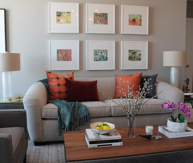
Before hanging the frames on the wall, we played around with the best arrangement for the 6 photos to be hung together. Again, a balance of colour, texture, etc. is key here. For example, there are three photos that contain a lot of red/pink/fuschia tones. They are the photos at the bottom left, centre top, and bottom right. They were dispersed evenly throughout the group so that there wasn't too much of the same colour in one area which would throw off the balance. 

Sometimes our own level of good taste and expertise surprises even us!


white frame gallery wall

Finally, find a guy with a hammer, tell him where to put your frames, have him whack some nails in the wall and hope that he followed your instructions properly. In our case, thankfully he did.

As I said earlier, art doesn't need to be expensive. Had we not gone with custom mats for these frames, this arrangement would have been even less expensive. Heck, throw your own scribbles into the frames and you can even save the $8 on photo printing. Live your own life. 
bz interiors toronto
To review, here is the cost breakdown of everything:

6 IKEA Ribba Frames - $120
6 Custom Cut Framing Mats - $120
Photo Printing - $8
Custom Gallery Wall Tailored to Your Exact Tastes - Priceless.

bZi

Wednesday 9 March 2016

NEW PROJECT REVEAL!


toronto interior design

Here's our latest work! Isn't she purrrrrdy?! We had a lot of fun pulling this one together and it didn't hurt that the client was an absolute JOY to work with.

First off, the client approached us because her space was a tricky one - very long and narrow and positioning the TV was a bit of a challenge without cutting off traffic in the room. She had a dining table that she was never really using (she preferred to eat and entertain at her kitchen island) so we got rid of it which allowed us to re-orient the room to take advantage of its long and lean bones.

What we decided to do was move the TV down to the far end of the room so that the back of the sofa didn't need to face the kitchen, opening up the entire space and making it feel WAAAAYYYYY bigger! New and old floor plans shown below: 

toronto designer

Putting the TV at the end worked great because the client was still able to view it when cooking at the kitchen, and it is still clearly visible from any spot in the main seating area. Plus, most people like to lie down to watch TV anyway, so with your head at the far end of the couch the viewing can't get much better!

Because there is a path of traffic past the TV in the hallway shown at the bottom of the right of the floor plan (leads to two different bedrooms) the media unit had to be quite shallow. We designed something custom here so that we could ensure the piece was shallow enough, and even put the TV on a fully-adjustable wall mount so that it can be moved around depending on where it is being viewed from. 

toronto custom cabinetry

The piece "floats" on the wall and we added perforated door panels not only for looks, but also heat control and for remote signal to easily penetrate. The components are hidden underneath and it gives a great opportunity to throw some pretty accessories on!

Because we eliminated the dining table, there was a huge focal opportunity to be had at the window when you enter the space, so we decided to go with a built-in window seat with storage, open shelving, curtains, cushions - the whole nine yards!

toronto custom furniture

toronto staging

The client wanted to do a gallery wall above the sofa, and she had a collection of floral photography she had taken herself. The injection of colour in the soft white frames is what brought all of the otherwise neutral main elements (paint colour, furniture fabric, millwork) to life, and we finished it off with some richly coloured pillows and accessories to finish off the look. (PS - that sofa just so happens to be a pull-out! The room even sleeps at least two people. HOW. GOOD. ARE. WE.)

gallery wall

We're immensely proud of how this one turned out and the joy we've seen in our client during the transformation of her space has been reward enough. 

top toronto interior designers

Just another happy BZi client! Are you ready to hire us for your tricky space? 
We'd love to hear from you! Check out our website or email us!

bZi

Monday 22 February 2016

SAKS IN TORONTO

Generally, I'm much more fascinated by residential interior design than commercial or retail - and in order for me to take notice in the latter it has to be really, really good. Saks has just opened up a flagship location in The 6ix downtown Toronto... and boy did I notice.

I had conflicting feelings about a Saks location opening up in Toronto (ie. originally American, just another high-end retail store, etc. etc.) but I must say that whoever was responsible for designing this store did an AMAZING job. Like 11/10 A+. 

Of course, I took a few photos for you to take it all in...

saks toronto

saks toronto

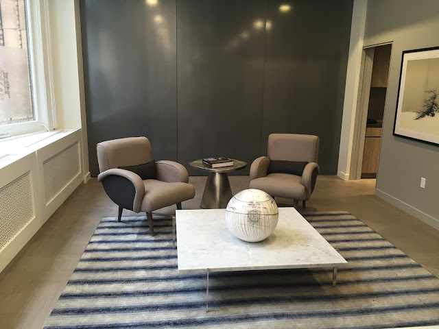
The stores were dispersed with beautiful rugs, and seating arrangements like this one - complete with a woman texting her baby.

new saks

The main floor featured a sparkly mosaic tile in one area which looked as expensive as it probably was. 

new toronto saks

There was also a cluster of hanging lights which also sparkled and blinked but unfortunately this did not translate to this photo. 

canadian saks

saks display

No expense was spared in the finishes or the fixtures, including this table which has an MSRP of $5700USD.

saks canada

There was also a side hallway which looked to be covered entirely in solid gold.

saks personal shopping

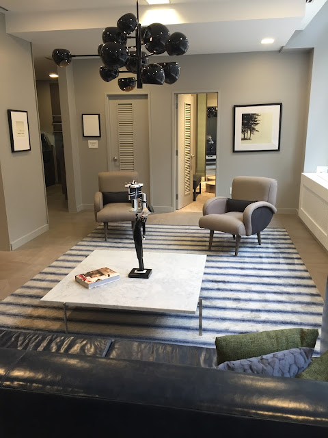
Saks will offer personalized shopping, and here is the lounge for those lucky people who will get to experience such luxury.

personal shopping toronto

I was told by a handsome Saks employee that the three panels shown at the back of this photo operate on some sort of winch system to lower or rotate (or something) to give access to some sort of full service bar. I asked said employee if he would demonstrate. He said no. 

saks personal shopping

saks toronto queen

The store had a very polished, mid-century, old Hollywood feel, complete with rounded furniture (as alluded to in my previous "Trend Alert" article, because I'm just that "with-it") and a lot of plush, low-pile wall-to-wall carpeting.

saks eaton centre

A linear installation of brass to add nice texture and interest to an otherwise dull wall.

celine saks toronto

My favourite aspect of the store was the almost "framed" vignettes for each of the brands represented. Far and away, Celine was my favourite. (Green carpeting - who knew!)

saks toronto

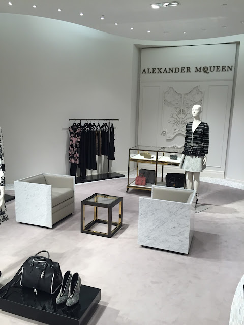
Praise to Alex McQ. Bad ass even from beyond the grave.

saks canada

saks louis vuitton

Louis Vuitton. 

saks queen yonge

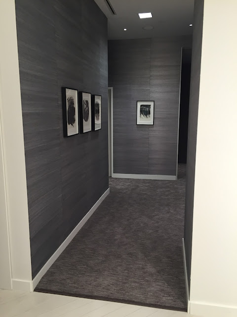
This is a hallway to some change rooms. This grass cloth wallpaper! C'mon!

saks canada

saks mens

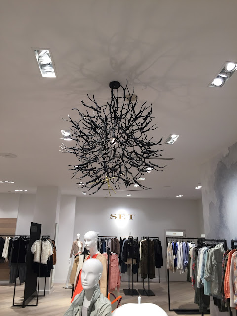
Lighting was also eye-catching - especially this fixture which is seemingly made up of singed corpses. Probably of those people who realized they couldn't afford anything here.

saks toronto

All in all, the store is beautiful and a welcome addition to the Toronto retail market. It is definitely a worthwhile experience to walk through and enjoy it, let alone the beautiful things they have available for sale.


What do you think?
bZd